


React is a widely used JavaScript library for building user interfaces and single-page applications. To ensure the quality and reliability of your React code, testing is crucial.
There are two main forms of testing in React: snapshot testing and component testing. Snapshot testing helps detect unexpected changes in your components' output, while component testing using Storybook allows you to verify the behavior and interactions of individual components in isolation. In this article, we will dive into both methods and demonstrate how to implement them in your React projects. Whether you are an experienced React developer or just starting, this guide will provide you with the essential tools and techniques for enhancing your testing process. So, let's get started!
Getting Started
Note: You can refer to this repo for the reference
Initialize the new next app by running npx create-next-app --ts [project name] . Then navigate to your project folder. For this tutorial, we will develop a Button component and add some props to make its properties more dynamic. So, at the root of your project, create a new folder named Components , and in that create another folder named Button. This folder will contain all our files related to the Button component like the actual component, its test, etc. In this folder create a file named Button.tsx. In this file, paste the following code.
import React from "react";

interface ButtonProps extends React.ButtonHTMLAttributes<HTMLButtonElement> {
  label: string;
  hasError?: boolean;
  bg?: string;
  color?: string;
}

const Button: React.FC<ButtonProps> = ({ label, hasError, bg, color, ...props }) => {
  return (
    <button
      {...props}
      style={{ background: bg, color, borderColor: hasError ? "red" : "green" }}
    >
      {label}
    </button>
  );
};

export default Button;
We have defined a Button component and are accepting props to control its properties from the parent component. Let's carry out end-to-end testing of this component using storybook and snapshot testing using jest.
Snapshot testing
Snapshot testing is a helpful tool to ensure that your UI does not change unexpectedly. It helps to render UI, takes a snapshot, then compares it to a reference snapshot. if both snapshots do not match, then either something has been changed or we need to update the snapshot with the new version.
For snapshot testing, we will be using jest. So let's get started with writing tests. But before that, we'll need to add some libs. So run the following command in your project root.
yarn add --dev jest @types/jest ts-jest babel-jest @babel/preset-env @babel/preset-react @babel/preset-typescript react-test-renderer @types/react-test-renderer
Once the above command succeeds, create a new file called babel.config.js in your project root and make sure that it looks like the one below.
module.exports = {
  presets: [
    "@babel/preset-env",
    "@babel/preset-typescript",
    ["@babel/preset-react", { runtime: "automatic" }],
  ],
};
We've all the prerequisites, let's write our test. For that, create a new file named Button.test.tsx inside the Button folder under Components. In this test file, paste the code below.
import renderer from "react-test-renderer";
import Button from "./Button";

it("renders correctly", () => {
  const tree = renderer
    .create(
      <Button label="Test Button" hasError={false} bg="yellow" color="black" />
    )
    .toJSON();
  expect(tree).toMatchSnapshot();
});
Let's understand the above code. it keyword tells the compiler that this is our test. As the first argument, we can give a short heading to our test which can describe what our test is about. While running the test, we'll get to see these labels in our terminal. Following that, renderer.create will create a DOM of the component supplied, then will convert it to json and will save its snapshot. Every time we'll run our tests expect will match the current snapshot with the existing saved snapshot. And if the snapshot does not match then it will give an error. In such a scenario, if the change was intentional then we will have to update the snapshot or else we will have to fix that unnecessary change.
Now before running the test, add "test": "jest" to the scripts object in your package.json. Let's run this test by running the command yarn run test in your terminal. You should see an output like below in your terminal.
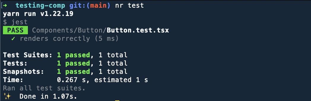
You are running this test for the first time, thus there is not any existing snapshot to compare. As a result, it will save this snapshot and will use this to compare it in the succeeding ones.
Now let's change the bg of our Button to any other color and run the test again. You should see your test failing as shown below.
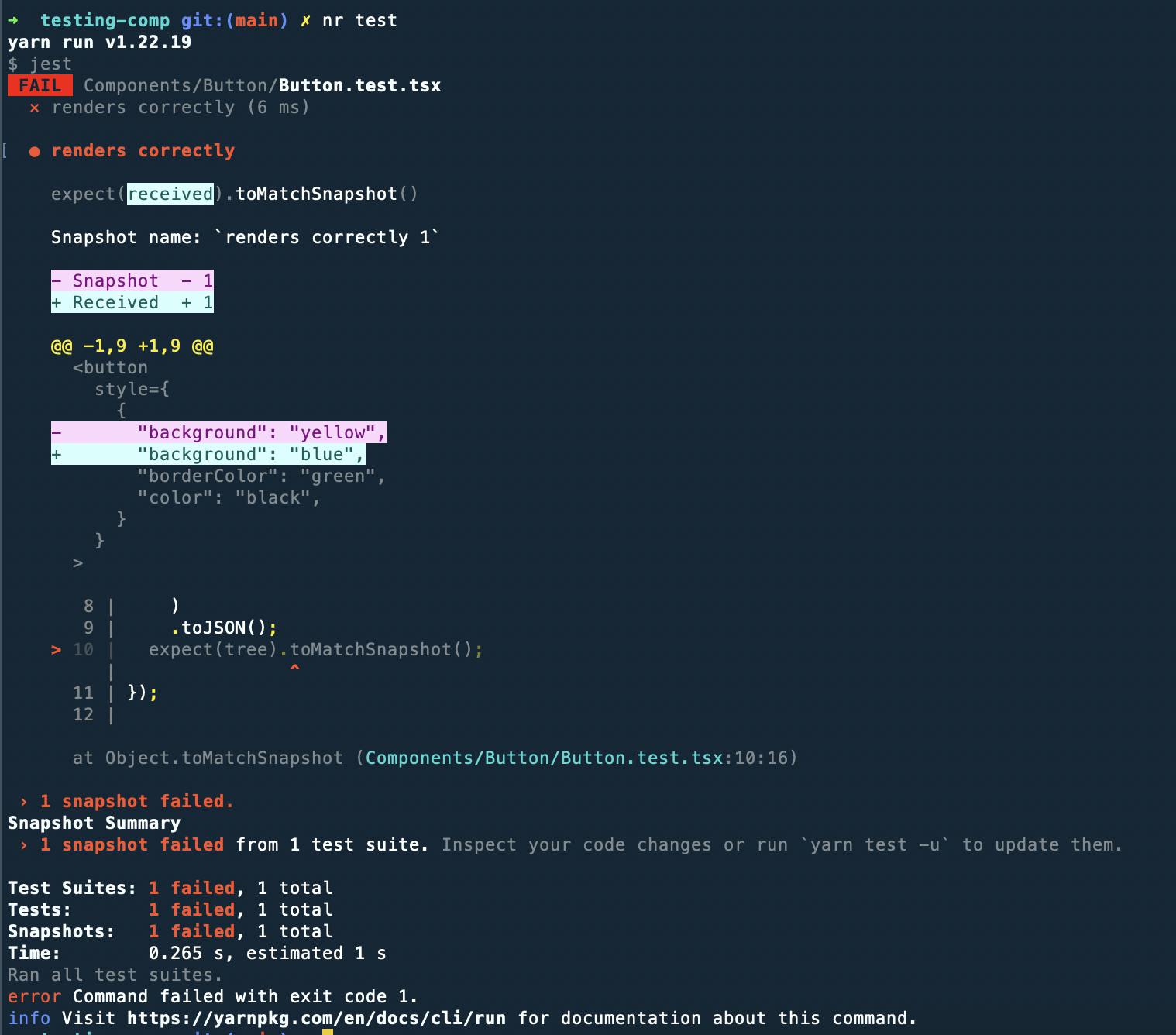
Now, we have made this change intentionally, so we'll have to update the snapshot with this new one. For that, we will have to run yarn run test --updateSnapshot in our terminal. You should see an output like below in your terminal.

Congrats! You have just introduced snapshot testing to your Component. Just like this you can test every component and make sure that everything works as expected and doesn't break anything in production. Now, let's move toward testing the Component in isolation.
Storybook: Testing in Isolation
Storybook lets us test our components visually and one component at a time. It helps us to document components for reuse and automatically visually test your components to prevent bugs. It also provides addons that help you do things like fine-tune responsive layouts or verify accessibility.
So let's get started by adding storybook to our project. For that run the below command in your root directory.
npx storybook init
Now, let's add Story to our component. Story captures the rendered state of your component. We can have multiple stories for each component, each story will describe a particular supported state of a component.
Let's create stories for our Button component. For that inside the Button folder of components folder, create a file named Button.stories.tsx. In that file, paste the below code.
import Button from "./Button";
import React from "react";
import { ComponentMeta, ComponentStory } from "@storybook/react";

export default {
  title: "Button",
  component: Button,
} as ComponentMeta<typeof Button>;
const Template: ComponentStory<typeof Button> = (args) => <Button {...args} />;

export const Primary = Template.bind({});
Primary.args = {
  label: "Primary",
  hasError: false,
  bg: "blue",
  color: "white",
};

export const Secondary = Template.bind({});
Secondary.args = {
  label: "Secondary",
  hasError: false,
  bg: "yellow",
  color: "black",
};

export const ChangeColor = () => {
  const [color, setColor] = React.useState("green");
  const clickHandler = () => {
    setColor((prevColor) => (prevColor === "green" ? "yellow" : "green"));
  };

  return (
    <Button
      label="Click to change Color"
      hasError={false}
      bg={color}
      color={"black"}
      onClick={clickHandler}
    />
  );
};
Explanation
Let's understand what's going on in the above code. Firstly we have to write stories according to the Component StoryFormat and an ES6 module-based standard. The key ingredients are the default export which describes the component and the named export which describes the stories. The default export metadata controls how Storybook lists your stories and provides information used by addons. Following the default export, we have defined Template which we will be using as the boilerplate for the following stories and we can just pass more arguments to it using Template.bind({}) and don't repeat the basic boilerplate. To change the properties or to pass an addon of a component, we can define those args using Primary.args = { }, Primary being the name of the extended component, as we've done above.
Now let's see each story of our component visually in our browser. But before that update the path for our stories in .storybook/main.js the file. and make sure that it looks like the one below.
module.exports = {
  "stories": [
    "../Components/**/*.stories.mdx",
    "../Components/**/*.stories.@(js|jsx|ts|tsx)"
  ],
  "addons": [
    "@storybook/addon-links",
    "@storybook/addon-essentials",
    "@storybook/addon-interactions"
  ],
  "framework": "@storybook/react",
  "core": {
    "builder": "@storybook/builder-webpack5"
  }
}
Simultaneously, delete the stories folder in your project root. Now let's run yarn storybook in your terminal.
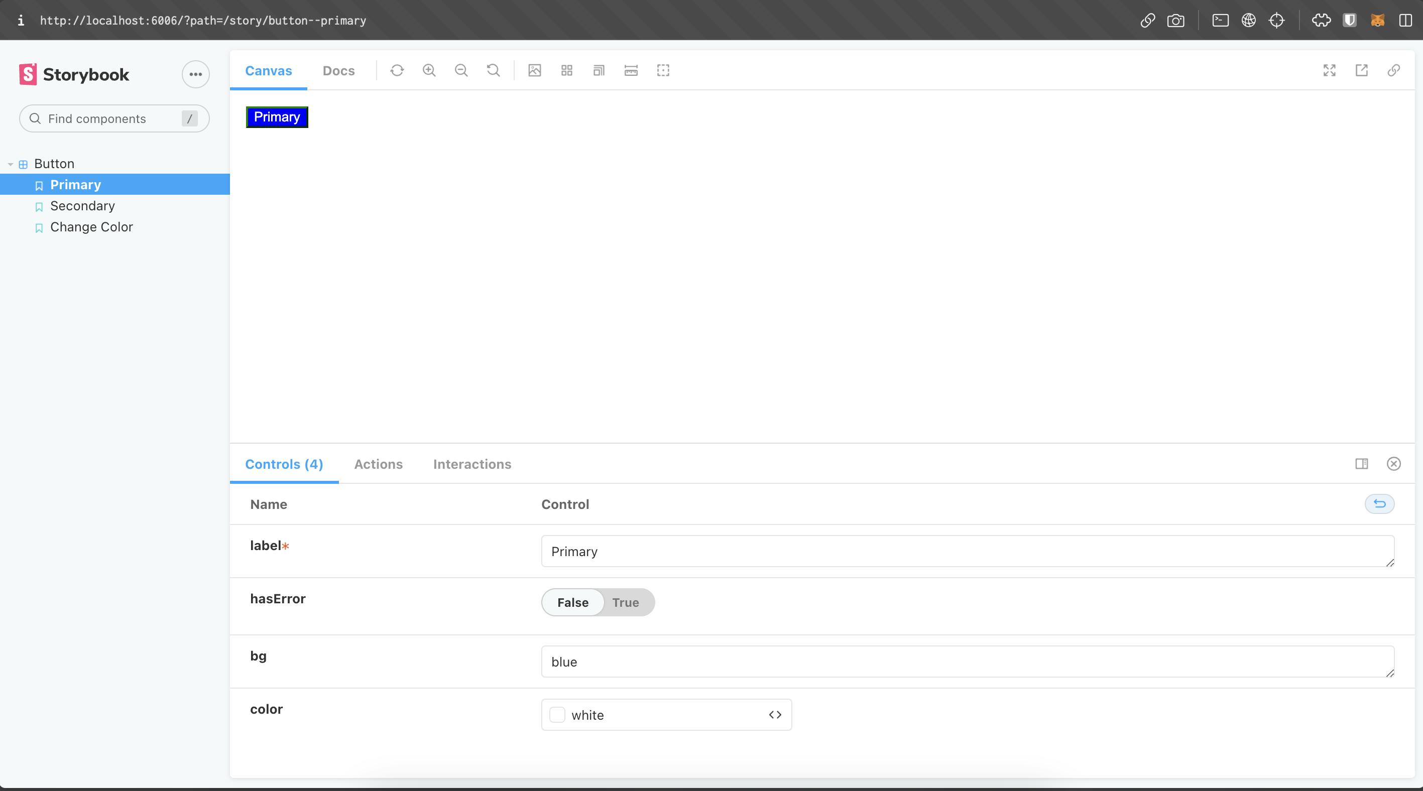
You should be able to see such a UI in your browser. You can see each defined story for our Button component under the Button label. Try playing along with Controls at the bottom such as changing the label, alternating the value of hasError props, etc, and see the visual change above. Under the Change Color option, try clicking the button, it should change the backgroundColor of the component as defined in the clickHandler.
Thus, Stories helps us to check that UI continues to look correct as you make changes. By viewing these stories without the combination/inflation of other components we can confirm that our UI component is not behaving unexpectedly and is rendering correctly.
This was the brief overview of testing components using jest and `storybook` and thereby you've successfully tested your component in isolations.